Free Webcomic – Bonus Mini Comic from Kindred Not
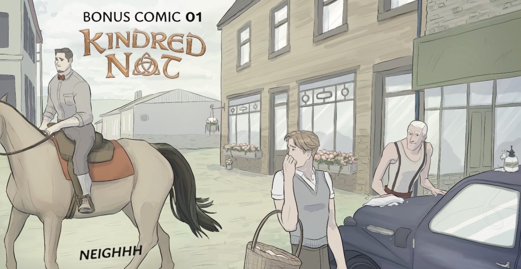
A free webcomic is waiting for you! This new mini comic has an an all-ages storyline and something for all readers to enjoy. Gabriella Balagna is the writer and illustrator behind this comic. The short story includes some appreciation for the timeless charm of babies as well as the historical. One part humor and two parts heart, this mini comic strives to put a smile on your face.
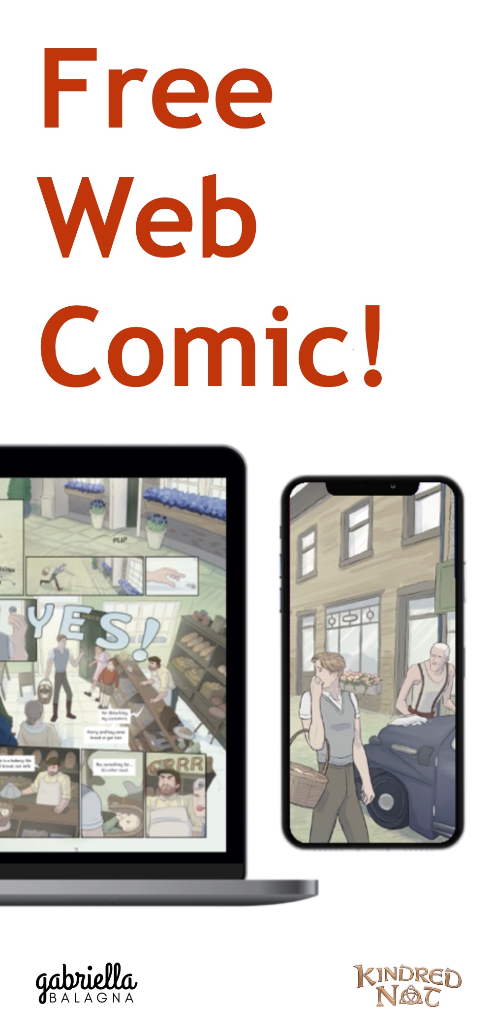
Get the free webcomic! To have the mini webcomic emailed to you, just join my mailing list. You can unsubscribe at any time. After signing up, you will get an email with the comic in high-res PDF files. You will receive both the desktop and mobile friendly versions of the comic.
Already subscribed, but still want to read the comic? Just check your inbox. An email containing the comic has been sent to existing subscribers. Thank you for your support!
Summary of the Story
This comic gives an insight into a common struggle – providing care for someone else. This mini comic is a side-story in the same universe as my webcomic, Kindred Not. The mini comic follows two of the main characters, Caden and Kenneth, from Kindred Not.
Here is the summary of the mini comic:
Caden’s day is off to a stinky start. The young man is usually pretty self-sufficient. However, when it comes to helping out a baby, he is a bit lost. Things are literally about to turn messy if he fails to find a solution.
The setting for the comic is the made-up country of Alford. Technology is much simpler than today’s standards in the comic. Additionally, the comic reveals war shortages are currently taking place, which causes some problems for the characters.

Format of the Mini Comic
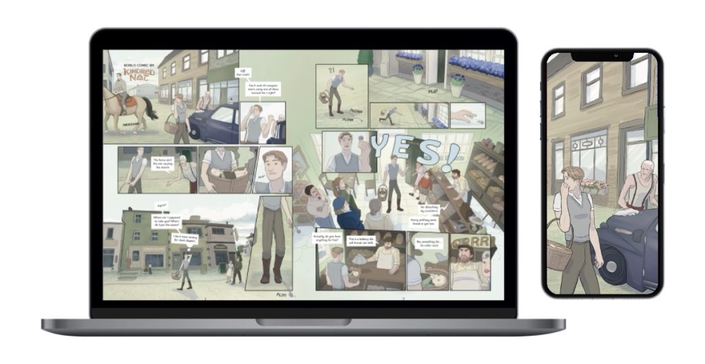
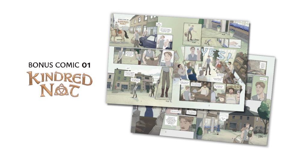
This bonus comic is bursting with colorful, high-detail illustrations. It is a digital comic made with the app, Procreate. The comic comes as digital PDF files. The files are high-resolution to maximize your enjoyment.
It is originally in the traditional page format. In other words, it follows the classic comic page layout. For example, it is four pages and a total of 30 panels long. This format makes the comic reading experience good for desktop users. The desktop format is read from top to bottom and left to right.
However, the comic is also available in another format as well. That is, the scrolling or “Webtoons” format. Offering the comic in this format as well makes it good for mobile users. This is because the panels in this format fill a narrow phone screen better. Also, the text is larger in this format so it can be more legible on a small screen. This allows for a better reading experience that does not require zooming in. Thus, readers will not struggle to see small panels or to read small speech bubbles. The mobile format is read from top to bottom by scrolling.

What Is the Purpose of This Free Webcomic?
One of the reasons for creating this comic is to allow the creator to say thank you:
Receiving kind comments and friendly encouragement on my previous comic, Derailed, was a gift. So, now I want to give back to those who enjoy and support my art. With this mini comic, I did not want it to be sloppy or quick. I deeply intend for it be something people can really enjoy. So, hopefully this new bonus comic will bring some joy to others. -Gabriella
Another reason for creating this free mini comic, is as a style test. It is practice for the upcoming, long-form comic, Kindred Not. Starting a new comic requires a lot of decision making when it comes to style. There are many choices to make about how a comic will look. So, this mini comic is serving as a style test for the long version. You can continue reading more about this below.
Trailer for the Free Webcomic
Below is a video giving a sneak peek of the story.
Style Decisions for the Webcomic
This mini comic is a side story for the Kindred Not comic universe. Making this mini comic involved making a bunch of style choices for how the long/main storyline comic will look. To make this mini comic, a lot of trial and error was used. Likewise, a lot of experimentation and practice were achieved. Although the long-form comic may look a little different, this mini comic acts as a good starting point for how it will look. By making this making mini comic, there are now a lot of rules about how the long-form comic will look.
For example, the process involved deciding a font style for Kindred Not. Firstly, experimenting with a bunch of different fonts. Next, experimenting with multiple font sizes to find the best one. After that, deciding the style of speech bubbles and tails. Lastly, creating some rules to standardize the sound effects.
Also, part of the process was choosing a format…or rather multiple formats. For example, deciding that the comic will be print, desktop, and mobile friendly. Also, searching for a way to reformat the comic from page layout to scrolling layout. Additionally, setting some rules for the page compositions. For instance, there will be a set range of panels per page. Similarly, choosing an appropriate thickness for panel borders.
Moreover, the process involved experimenting with drawing styles. For instance, trying out thin lineart. However, realizing that this takes too long to draw. Additionally, deciding which types of digital brushes to use for lineart, flatting, and shading. Furthermore, testing out a color palette and coloring style. Finally, practicing drawing two of the main characters and creating background characters.
Knowledge from Making this Free Webcomic
A lot of knowledge about comic making was gained from making this mini webcomic. But here are four main lessons learned that will be kept in mind:
- Use more closeups of the characters’ faces. There is no need to place the “camera” so zoomed out all the time. Readers need to see the characters’ expressions so they can connect with what they are feeling. Do not take it to the extreme of “talking heads,” but do not be afraid of just drawing characters up close.
- Avoid wide, horizontal panels. These do not work well for mobile format, as they appear small, rather than immersive. Also, they make for too fast of a reading pace, as they do not take much scrolling to pass by. Instead, use big, vertical panels for establishing shots. These fill mobile screens better and feel more immersive.
- Simplify, work in bulk, and use routine. This will increase the ability to work faster. To finish a long format comic, you cannot work at a snail’s pace. So, simplify, work in bulk, and use routine. This will help to output more in a shorter timeframe.
- Use the VizRef app to compile photo references. It is such a time saver and a few bucks well spent.

Read Free Webcomics!
Thanks for reading, folks! To get the mini comic, click the button below. (Existing subscribers have already been emailed the comic.)
If you like this mini comic, you will also enjoy the larger comic it’s based on called, Kindred Not. So, subscribe to this site to get updates when the comic pages come out and to follow its development. The long-form comic will reveal more about the same characters from the mini comic.
Also, check out my other free webcomic, Derailed. It is already fully complete. It follows the adventure of a young architect, Toby. He struggles to sift through mystery and hatred due to a tragic architectural failure.


Discussion (5) ¬