Scrapped Concept Art – Unused Designs from the Comic, “Kindred Not”
Scrapping concept art is kind of expected. However, it is a shame for concept art to become completely forgotten. That’s why, I am gathering a large collection of my scrapped concept art here.
Specifically, this scrapped art is all for a comic I am making called, Kindred Not. Included below are scrapped character designs, background studies, color palettes, and logos – all for planning the comic. Despite that this art will not end up in the final comic, it was still worth while to make. It just does not entirely fit the style or feeling that Kindred Not requires.
For more announcements and development about Kindred Not, you can follow along by subscribing to my blog and comic updates. Also, the first episode has now launched; so you can read Episode 1 of Kindred Not now.
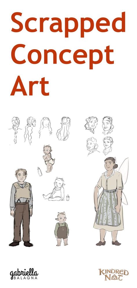
Scrapped Concept Art of Characters
The first discarded concept art to discuss is some of the most important: the characters. It is very important to have appealing characters in a story, as they are often the force driving it. Of course, the characters do not need to be super hot or drop dead gorgeous. However, their designs still need to be thought out and work well together.
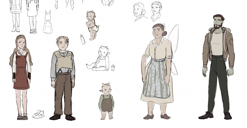
Below are a few rough clothing designs of Kindred Not’s main character, Amelie Dunald. Some made the final cut for the comic, while others did not – and that’s okay.


Scrapped Concept Art of Faces
Below is one of the first tries I had at designing the main cast for Kindred Not. I began by just coming up with their faces and not worrying about the rest of their designs. The script was still in a rough stage at this point, so I did not have a completely solid idea on how to design their faces. For example, in the script, the little boy got rewritten to be only ten months old, so eventually I had to revise his design to make him look younger. Additionally, for the old lady, I did some experiments to try out very different shapes for her face.
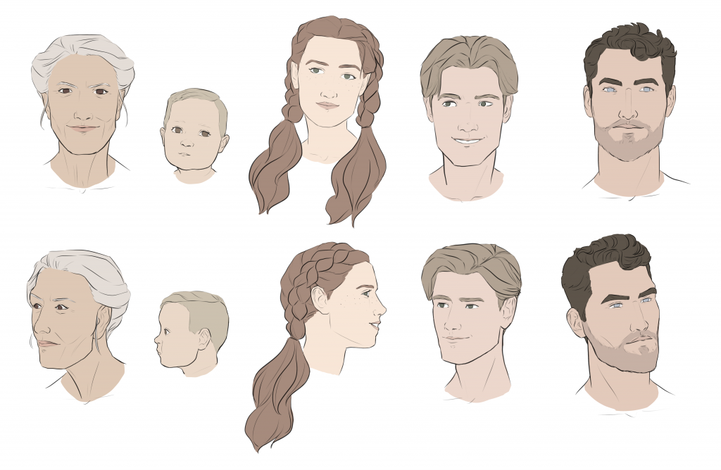

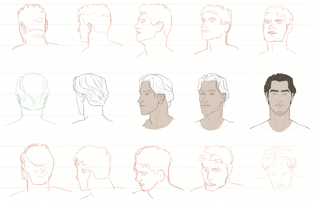
The next two pictures are failed attempts at designing the face of a character named, Ronan. I wanted to make sure Ronan looked different from the other young male character in Kindred Not. So I ended up trying several face shapes for him. Honestly though, nothing was turning out, and I was not liking anything I was coming up with. I am still not happy with his final design, but I did not want to waste too much time on it, as I can always let it evolve in the future.

Scrapped Concept Art of the Main Cast
Underneath this paragraph are some explorations and initial character designs for the main cast of Kindred Not. At first, I contemplated the comic being a fantasy comic, but decided against it in the end. Even though the baby looks pretty cute with his bitty horns, tail, and speckled skin, fantasy did not seem to mix well with the comic’s storyline. Additionally, I thought about two of the characters being young kids, but the story works better with them as teenagers. Accordingly, their final designs ended up looking much older.


Under this paragraph, are some clothing explorations for two characters from Kindred Not. Their names are Ronan and Caden. Since they are both young men, I could not have their outfits looking too similar. Otherwise, it might be hard for readers to tell them apart. Kindred Not has a fictional, historical setting, so vintage fashion styles have a great influence on these designs. My goal for the outfits in Kindred Not is something I describe as “old-timey, casual.”


Scrapped Background Character Designs
Below are some soldier/guard designs for Kindred Not. The on the bottom right is a tracing from a photo to get a quick understanding of the proportions/look of a vintage soldier uniform. The others are some freehanded designs to try and get the aesthetics right. I am decently happy with the design on the top left, so the final design of the guards is pretty similar.

Next, are some background character designs. These designs are not getting tossed out per say. However, they do no need some refining and cleaning up. Making these quick sketches is super helpful though at getting a cohesive look for the fashion in Kindred Not, as well as some ideas for the color palettes of the clothes. I truly have a passion for creating vintage style drawings. It would be so fun if people still dressed like these characters today.


And finally, the last scrapped concept art are some clothing designs for background characters. The reason these designs are scrapped are because they are tracings from photos. These were done more just for study purposes and to collect some ideas for the fashion in Kindred Not. The comic is in a made up world, but I wanted to ensure that the fashion of the background characters all looks like it could be from the same time period. Making this sheet also helped me figure out a color palette for background characters as well. The sketches above have a clear influence from these studies. And some of these outfits even made it into the final comic.

Scrapped Concept Art of Backgrounds
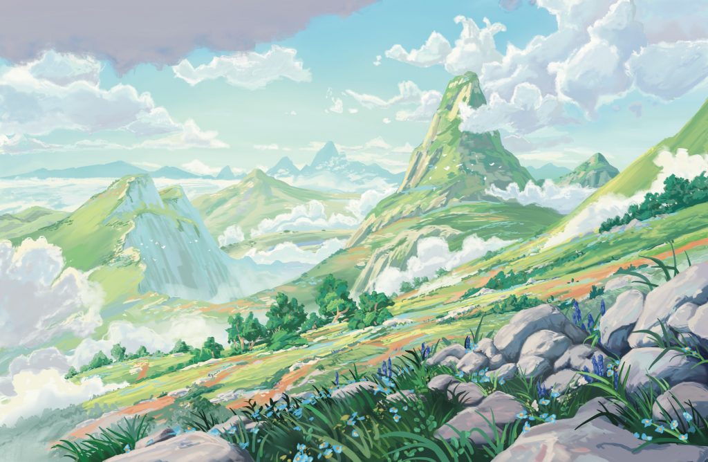
The next scrapped concept art involves some background practice. For Kindred Not, I really want the backgrounds to have a picturesque, Studio Ghibli feel to them. So, I started studying how to improve my skills at making backgrounds.
Background Painting Study
The first background below is a replication of a painting by Lorenzo Lanfranconi. I absolutely adore this man’s painterly background style. So I did this study to try and figure out how he creates his paintings. In order to achieve the right look I had to search for some new digital paintbrushes to download. None of the ones I found were quite right, so I adjusted them a bit until I could create similar strokes to Lanfranconi.
My version of Lanfranconi’s painting came out a little differently hued. This is because I decided to try replicating it in CMYK instead of RGB. The colors in Lanfranconi’s original are stunningly vivid, but printers are not able to produce such saturated colors. And seeing as I plan to one day print Kindred Not, I must avoid using colors that will not display right when printed. Furthermore, even though I will not be printing this background study, I wanted to try painting in CMYK to better understand the more limited range of colors it offers.
Background Photo Studies
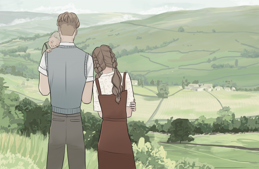
The next background study I did for Kindred Not is shown below. It actually started out as just concept art of the characters. But the drawing was calling for expansive, lush, rolling hills as the background. So even though the perspective does not quite work right with the characters, I found a photo to reference for the background. The setting for Kindred Not was originally inspired by rural Scotland. I wanted to capture that overcast, green-toned look of rural Scotland in this background, so I changed the colors from the reference image a bit to convey that look better.
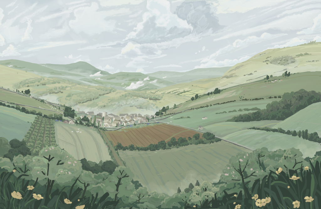
As well, we have here another background photo study below. This one is of Haworth, England. The amount of skills and knowledge I now have just from doing this study is baffling to me. In fact, looking back, this photo study really had a strong influence on the Issue 1 cover for Kindred Not.
Want to see how I drew the background below? Read more about it here: How to Draw Backgrounds

Furthermore, the next images are a photo mood board to help envision the setting for the comic. The images are all from Pinterest and I adjusted the colors so they would all have a cohesive mode. Now the script is no longer just a draft, I have cut several of these locations from the comic. However, the majority still are.

Original Background Practice
After completing the previous background studies, I was ready to try making up one of my own, which you can see below. I referenced a whole bunch of photos and backgrounds with a similar feel, and came up with this charming countryside view. Again, I was going for that slightly overcast, green-toned look. However, this look is very hard to do while still achieving enough contrast. Anyway, this painting does not quite capture the style I want for my comic, but it is bringing me closer to achieving it.
And next is some more original background practice. Painting grass is still a big struggle for me, but I do like how realistic Rona turned out.

Scrapped Color Palette
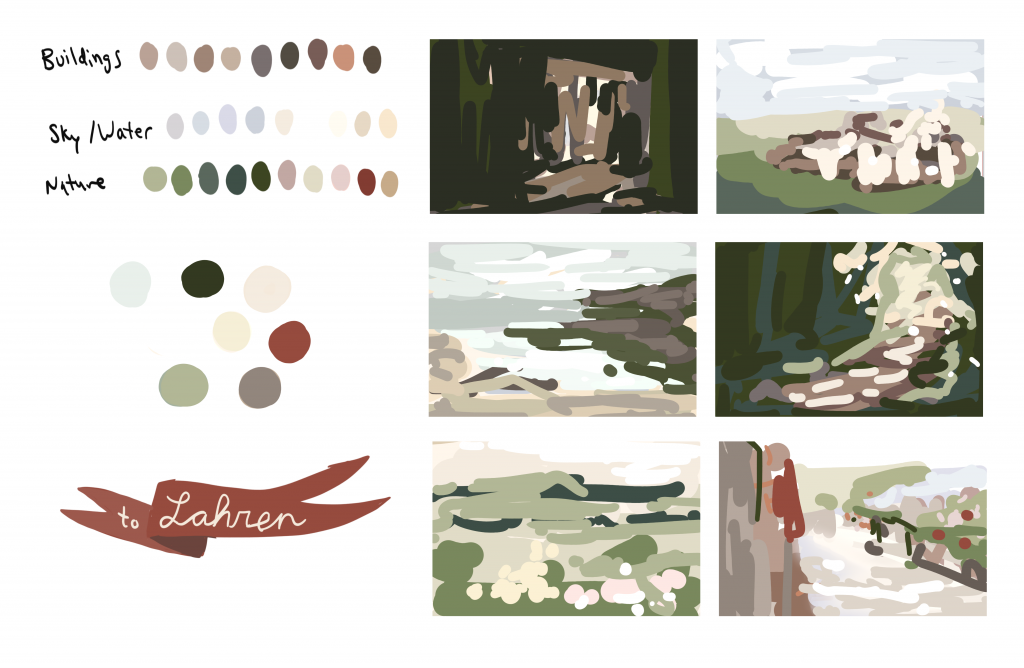
The next discarded art from Kindred Not are some color studies, which you can see below. I simply shrunk down six photos and used the color dropper to turn them into these painterly thumbnails by going right over them. This gave me some ideas of the colors to use for Kindred Not. However, they came out too saturated and high contrast for my liking. Still, doing this study helped me decide that I want to use a lot of greens, grayish skies, and also some pale colors in the comic. Also, in the bottom left corner is a discarded logo idea from the comic’s initial name idea.
Below is another moodboard, this time to help establish the comic’s color palette. I simply blurred out the photos so I would focus less on the details and more on what colors are in the images. Then, I added a few colorful splotches to test out some colors to use for flowers.

Scrapped Logo Concepts
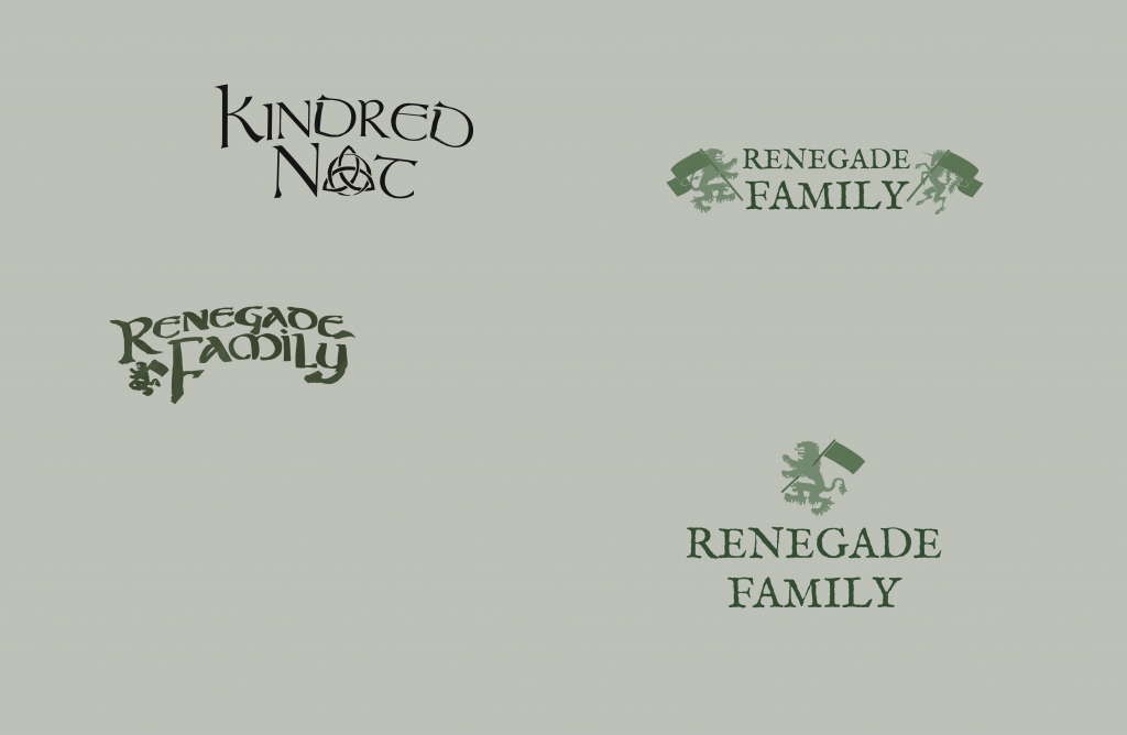
Finally, the last scrapped concept art I have to share from Kindred Not are some logos. For a while, I struggled coming up with a good name for the comic. Originally, I named the comic, To Lahren. That is because the whole story revolves around characters going to the country of Lahren. However, since Lahren is a made up country name, it kinda seems more like a person’s name. Also, it would be hard for people to remember how to spell it. Then, I thought about calling the comic, Renegade Family. But the main characters are not an actual family, nor are they all renegades.
Consequently, since the characters are not an actual family, this led me to the name Kindred Not. “Kindred” can literally mean “family.” But I originally became familiar with the term through the book, Anne of Green Gables. In there, they use it to mean good friends that think alike or people that get along well.
Additionally, I discovered something called a “Celtic knot” which can have various symbolic meanings. My comic has some elements inspired by Celtic culture, so this was a really cool discovery. And it helped the “Not” part of the title take on a whole new meaning, as I turned the “O” into a Celtic trinity knot. You can see the initial sketch for the final logo below.

More Extras for Kindred Not Comic
I hope you enjoyed all this scrapped concept art! If you did, you can read more articles about Kindred Not. Also, for more announcements and development about the comic, you can follow along by subscribing to my blog and comic updates.
*Update: You can now see the characters’ finalized turnaround sheets. As well, you can read about the characters on the cast page for Kindred Not. Furthermore, Kindred Not Comic has now launched; you can read Episode 1 of Kindred Not now.
Discussion (4) ¬